In early 2024, gold reached the price objective derived from the breakout of the large triangle that had evolved beginning in early 2022. Upon reaching the area of the objective, a classic buying climax halted the trend.
The subsequent trading range has been characterized by distribution. In the event of a breakout lower, the amount of distribution (cause) derived from the Point and Figure (P&F) count suggests a downside objective of 10–12% lower is reasonable. But will it reach this price objective?
In this article, we’ll make a technical assessment of the daily and weekly charts, provide evidence suggesting that the range is likely distribution (Wyckoff), and show how to assess potential price objectives using point and figure charts.
Weekly Chart of Gold

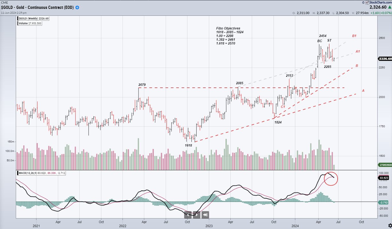
CHART 1. WEEKLY CHART OF CONTINUOUS GOLD CONTRACTS.
In November 2023, gold broke above lateral resistance developed along the $2079–$2085-per-ounce area.
- The lateral resistance and rising support generated by the trendline (A) defined a large triangle.
- In anticipation of a breakout, it seemed appropriate to determine upside price objectives.
- I prefer to use multiple techniques to generate objectives. I particularly like Fibonacci extensions and retracements, point & figure chart projections, and price channels.
- I look for confluences of multiple techniques and combine them with traditional chart support and resistance to generate objectives.
Objectives are useful in three ways:
- To ensure that reward exceeds risk to the stop by at least 3 to 1.
- To monitor for trend-ending action around those objectives.
- To adjust existing trades as those objectives are reached.
Importantly, the original breakout from the 2079–2085 triangle generated a price objective of 2540. That objective is derived thusly:
- 2079 (initial point of the triangle ) – 1618 (bottom of the pattern) = 461 points.
- 461 points added to the triangle top (2079 + 461) = 2540 objective.
I believe triangle price objectives are areas to monitor for resistance rather than discrete points.
Additional objectives can be derived using Fibonacci Objectives derived from the 1618 – 2085 – 1824 price sequence.
- 1.382% = 2461 & 1.618% = 2570.
- Soon after the breakout from the triangle, a confluence of objectives could be calculated: 2461, 2540, and 2570.
- Potential objectives can also be derived by channelizing the price behaviors.
- I prefer overbought and oversold as defined by price channels than by momentum (i.e. stochastics, RSI or MACD).
In March, the market broke out of the triangle and, over the next several weeks, marked up to 2454.
- The combination of overbought in the channels and the 1.382% Fibonacci objective (a bit short of the 1.618% objective), and in the area of the triangle objective, clearly defined an area of the chart where supply was likely to develop.
- As the price approached the objective confluence, it had already exceeded the two main channel tops at A1 (derived from trend line A) and B1 (derived from trend line B), and overbought conditions had developed in momentum measures, like RSI and stochastics.
- When I see resistance confluences of this nature, I begin to monitor for trend-ending action (for instance, a buying climax and secondary test pattern).
- Despite very bullish news and strongly bullish sentiment, a classic buying climax (BC) developed. Note the much higher than normal volume that occurred on a wide range bar that set a significant new high, but closed near the bar’s low.
- Buying climaxes typically resolve into trading ranges. Trading ranges can be distribution (marking a long term top) or re-accumulation (a pause before continuing higher).
- Over the next three weeks, the market pulled back to 2285, then rallied in a secondary test (ST). The secondary test was completed by a wide price spread bar that closed near its low. This is the juncture at which I became particularly interested in the pattern of price and volume and the potential downside objectives.
- The price-volume relationships should point toward either distribution or re-accumulation.
Generally speaking, there are only two outcomes to the range: either the buying climax is short-term, and the market will move higher after a period of re-accumulation, or the buying climax will offer a significant top, leading to a significant markdown once supply is completely distributed to weak hands.
This is when I shift attention to the daily perspective chart to closely monitor price spread and volume relationships.
Daily Chart of Gold
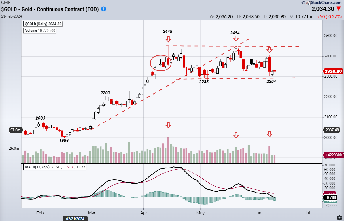
CHART 2. DAILY CHART OF CONTINUOUS GOLD CONTRACT.
Without going into a detailed Wyckoff price/volume analysis, I will make the case that it is likely that the range is one of distribution. Note the appearance of supply (inside the oval) just before the buying climax at 2449, the lower volume and angle of attack on the rally to 2454 (secondary test), and the expansion of volume and close near the low of the price spread (last arrow). Rallies inside the range are being aggressively sold as strong hands distribute to weak hands. Additionally, much of the price action has developed below the midpoint of the range.
With the assessment of distribution, I thus need to begin planning for a bearish breakout. The first part of the plan is to arrive at some estimation of how much downside potential exists.
- One of Wyckoff’s main principles is “The Law of Cause and Effect.” Cause refers to the amount of accumulation or distribution that occurs inside a range. Effect is the extent of the move out of that range.
- The accumulation or distribution inside a range determines how far the breakout of the range will move. In other words, the time spent in the consolidation is related directly to the distance of the subsequent move.
- Point and figure (P&F) charts are used to determine the extent of the cause and generate initial price objectives out of the range.
Gold P&F One-point Boxes X 3 Box Reversal

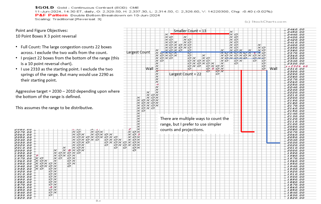
CHART 3. POINT & FIGURE CHART OF GOLD CONTINUOUS CONTRACT.
Trading ranges represent areas of the chart where large numbers of shares change hands, often moving from strong hands to weak hands. This is why a consistent relationship exists between the length of a trading range and the size of the subsequent move. This is particularly true in very liquid, heavily-traded markets.
There is no end to the debate regarding which points should be used to define counts. I like to keep it simple. I look for the walls of the range, count across the two walls, and then project from the low. Others would use the smaller count derived from the two walls between the buying climax and the secondary test. After all, I mostly use the objectives to help define risk vs. reward and to help draw my attention to the chart as the area of the objectives is reached.
Assuming the current range does not extend and I am correct in my assessment of distribution, the count projects enough cause to suggest downside of 2010–2030. If the range extends, the count will lengthen, and the price objective grows greater. With this view, I should be able to fashion a trade well in excess of 3-1 (minimum) risk reward. I suspect that when a trade sets up, that risk-reward will be in excess of 10-1, as a stop versus my entry is likely to be less than 1%. If I am wrong and the range is one of re-accumulation, the same method can be applied to a breakout higher.
Please note that this is not a trading recommendation. Entry will be determined by price action and trade implementation techniques that I hope to present in future pieces.
Shared content and posted charts are intended to be used for informational and educational purposes only. The CMT Association does not offer, and this information shall not be understood or construed as, financial advice or investment recommendations. The information provided is not a substitute for advice from an investment professional. The CMT Association does not accept liability for any financial loss or damage our audience may incur.

