
Safe-haven investments like gold, silver, and now Bitcoin have had a bumpy and uncertain rise, but they’ve all ascended despite mixed opinions from analysts. This rise is due to fears of inflation (or slow growth with inflation), record-high US national debt, changing Fed rate expectations, and record purchases by central banks, especially among the BRICS nations.
Except for Fed rate cuts, which might happen sometime toward the end of the year, much of everything mentioned above is likely to continue in the direction they’ve been going—which is against the US dollar(‘s value of).
Bearish Near-Term, Bullish Long-Term
Aside from interest rates remaining steady, if not another hike (depending on the upcoming trio of inflation reports), there’s another reason to anticipate a potential dip before the next leg up: seasonality.
Gold, silver, and Bitcoin all experience summer doldrums. So, based on this expectation, should this seasonal pattern repeat this year, let’s assume there might be a dip in the near-term followed by a potential bullish surge toward the end of the year. If you want to get into any of these safe havens, might this summer be a time to load up on positions?
Tools for Analysis
The objective is to examine the seasonality outlook and compare it to the current price context. To do this, it helps to look at StockCharts’ Seasonality tool and the tools in StockChartsACP to fine-tune your analysis. This article will use the Fibonacci Retracement tool and the Money Flow Index (MFI) to fine-tune its analysis.
Seasonal Hot Summer “Dips” in Gold, Silver, and Bitcoin
Since you’re likely a stock trader or investor, let’s not just look at each asset’s seasonality by itself, but compare its seasonal performance against the S&P 500 ($SPX) to see its historical performance against the broader market (which may bear similarity to your portfolio).
Using StockCharts’ Seasonality tool, pay attention to the following two figures and note that we’re looking at a 10-year seasonality cycle:
- The bars (and numbers above them) represent the % frequency of the asset closed higher, in this case, relative to the S&P.
- The % figure at the bottom of the bar reflects the average return over 10 years relative to the S&P 500.
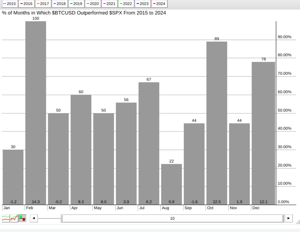
CHART 1. SEASONAL 10-YEAR CHART OF BITCOIN AGAINST THE S&P 500. Note the higher-close rate versus the average returns.
Bitcoin’s higher close rates and returns in June and July are decent, with August being the worst-performing month (summer doldrums). But almost all months tend to get dwarfed by the October higher close rates and returns (89% higher closes and a 22.5% average return).
Now, let’s look at silver’s ($SILVER) performance.
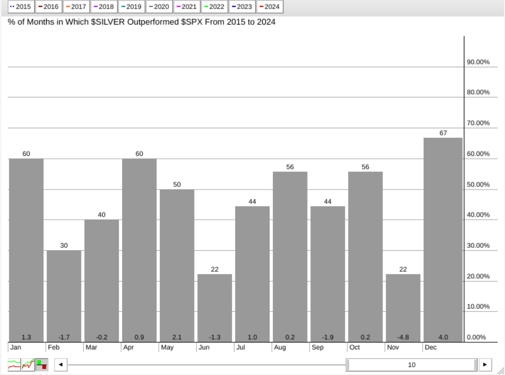
CHART 2. SEASONAL 10-YEAR CHART OF SILVER AGAINST THE S&P 500. Note the weakest performances in June and November vs. its outperformance in December.
Not quite as brilliant as Bitcoin, but silver ($SILVER) is the neglected sibling among the three. Compared to the S&P 500 (remember, we’re not looking at each asset’s seasonality on its own), June through November tend to hover from negative to almost no movement despite the higher closing rates in August and October. November is the worst month for silver, but December is the month the white metal tends to outshine the broader market, with a 67% higher close rate and a 4% return. Again, this supports the bearish to bullish pattern that the market tends to be expecting on a fundamental basis.
And finally, gold.
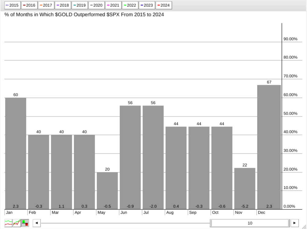
CHART 3. SEASONAL 10-YEAR CHART OF GOLD AGAINST THE S&P 500. December and January are the strongest months for gold compared to the broader market.
Relative to the S&P, gold’s ($GOLD) performance looks similar to that of silver’s, with November being the worst month and December (but also January) exhibiting the strongest relative performance, with a 67% higher close rate and a 2.3% average return over the last 10 years.
So, if you reshuffle your portfolio with these safe-haven assets, you’d have to figure out which assets you’d be overweight and when while maintaining your broader market portfolio.
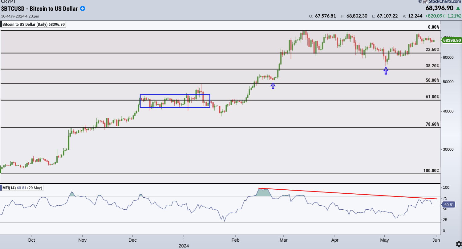
CHART 4. DAILY CHART OF BITCOIN. The crypto is in a trading range, but momentum is declining.
According to some analysts, during the traditionally slower summer months, prices may seek a new catalyst, potentially causing Bitcoin to drop below $50,000. Also, note the slight bearish divergence in the declining Money Flow Index (MFI) line and the almost flat range, signaling a drop in buying momentum. Assuming that’s the case, prices would first have to break below support a few points above the 38.2% Fibonacci retracement level (see blue arrow). A drop below this level would likely find support above the 50% Fib level (see blue arrow), below which we see the $50,000 price mark.
There’s likely to be some technical buying activity near this level. However, should prices continue drifting lower, the range between 50% and 61.8%, an ideal buying range, would also coincide with a four-week historical congestion range (see blue rectangle) above which there may be strong support. You should reassess your bullish outlook if the price falls below this level.
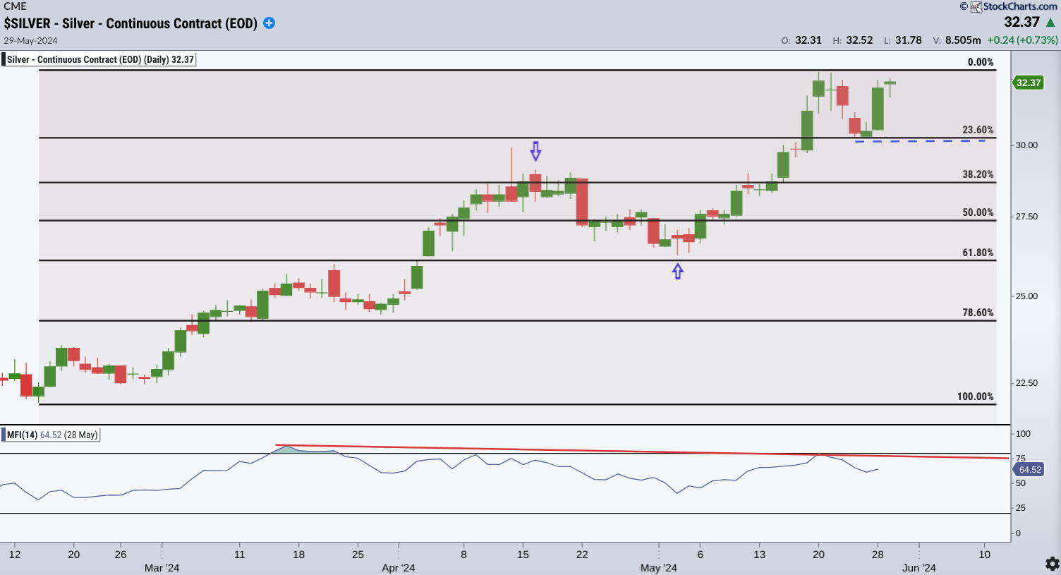
CHART 5. DAILY CHART OF SILVER. Note the strong surge in silver. Is it topping or does it have more room to run?
The slight divergence in the MFI shows a stronger price surge against slightly weakening momentum. Still, it makes you wonder if silver may be topping. As an industrial metal, in addition to being a monetary metal, silver has a different fundamental path. Nevertheless, it has a similar seasonality profile to Bitcoin and gold—summer weakness and end-of-year strength.
If prices top at the current highs, silver would have to break below its swing low (see blue dotted line), coinciding with the 23.6% Fib level. A break below this would likely find support at the 38.2% line coinciding with former resistance (see blue arrow). The next swing low, also an ideal buying range for those looking to go long, would be near $26.25, where the 61.8% Fib level sits.
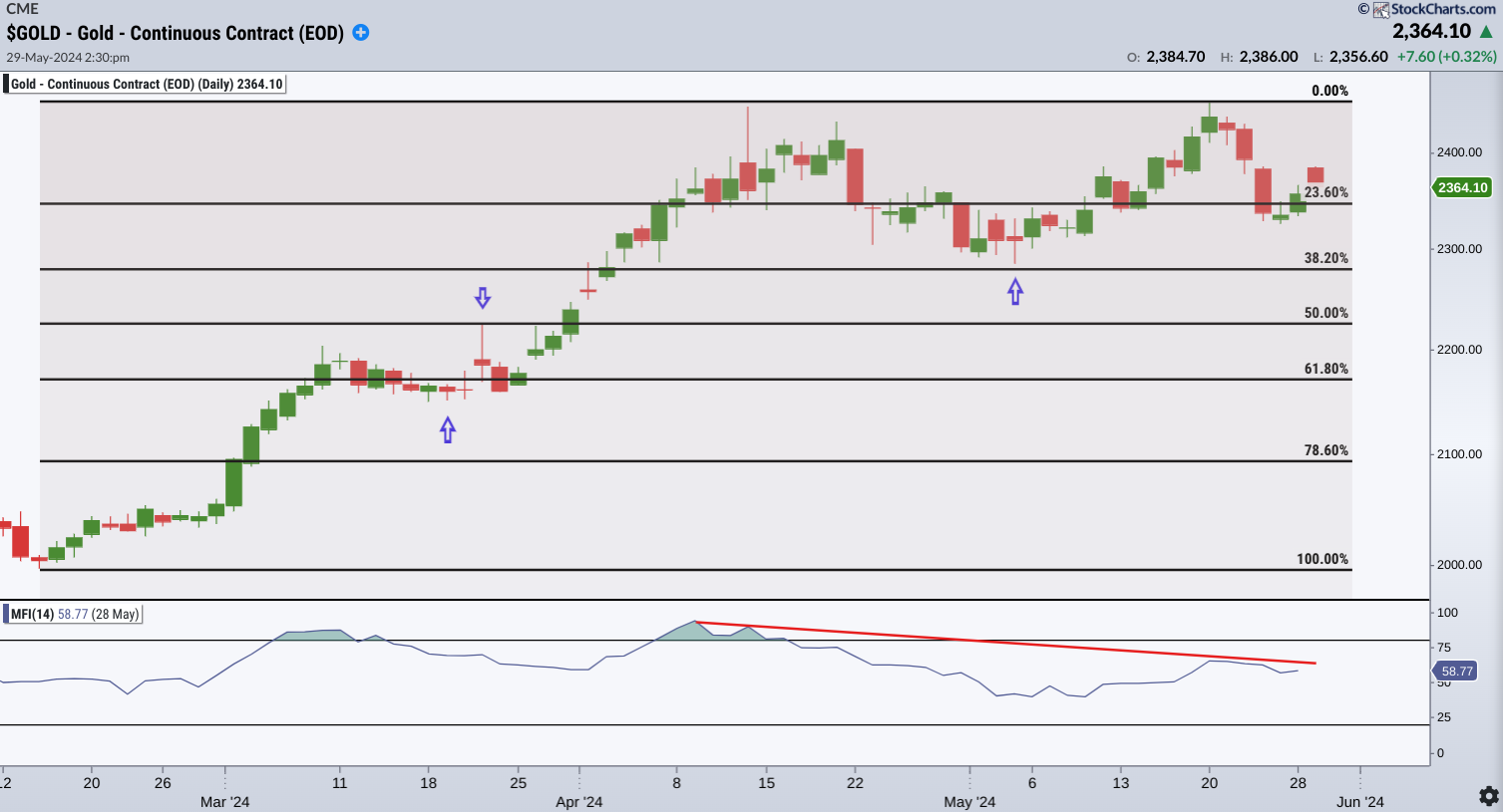
CHART 6. DAILY CHART OF GOLD. Gold looks like it’s topping. But there’s plenty of clear support below it.
It looks like an intermediate-term double-top pattern, but whether this ends up being a correction or a much longer decline depends on several factors, one of which is the Federal Reserve’s rate actions.
Assuming a correction, the blue arrows indicate clear market-based support (and potential resistance-turned-support) levels. These coincide with the 38.2%, 50%, and 61.8% Fib retracements. Similar to the Bitcoin example above, you can also see a downsloping MFI line from the overbought range, indicating a slight weakening in buying pressure. If you’re following the seasonal narrative, near-term weakness followed by a bullish run toward the end of the year, the range between the 50% and 61.8% Fib levels may be a favorable entry. Just be sure to buy when technical conditions, from patterns to momentum, indicate a strong bullish reversal.
The Takeaway
When “buying the dip,” identify strong reversal patterns and signs of bullish momentum. Despite the mixed opinions analysts may have on these three safe-haven assets, they have all responded to inflation, changing Fed rate expectations, and strong central bank buying (concerning gold, but also as an indication of challenges in the global economy and the US dollar).
Seasonality-wise, these assets often experience summer doldrums, potentially leading to near-term dips before a bullish surge towards the end of the year. If you’re considering going long, this summer might present an opportunity to buy. Keep an eye on the Fib levels.
How to Access the Seasonality Tool
There are different ways to access the seasonality tool in StockCharts.
- Click the Charts & Tools tab at the top of the StockCharts page, enter a symbol in the Seasonality panel, and click “Go.”
- Enter the symbol in the ChartBar at the top of the page and select “Seasonality” from the dropdown menu on the left.
- From Your Dashboard, in Member Tools, click on Seasonality.
- Below the seasonality chart, you’ll find links to instructions and quick tips that give more detailed instructions.

Disclaimer: This blog is for educational purposes only and should not be construed as financial advice. The ideas and strategies should never be used without first assessing your own personal and financial situation, or without consulting a financial professional.

