Note to the reader: This is the seventeenth in a series of articles I’m publishing here taken from my book, “Investing with the Trend.” Hopefully, you will find this content useful. Market myths are generally perpetuated by repetition, misleading symbolic connections, and the complete ignorance of facts. The world of finance is full of such tendencies, and here, you’ll see some examples. Please keep in mind that not all of these examples are totally misleading — they are sometimes valid — but have too many holes in them to be worthwhile as investment concepts. And not all are directly related to investing and finance. Enjoy! – Greg
To begin Part III: Rules-Based Money Management, we need to review a few basic technical indicators that are referenced frequently. Their concepts are used throughout this part of the book. Remember, Part III is the creating of the weight of the evidence to identify trends in the overall market, a ranking and selection process for finding securities to buy based on their individual and relative momentum, a set of rules and guidelines to provide you with a checklist on how to trade the information, and the results of my rules-based trend following strategy, called Dance with the Trend.
Moving Averages and Smoothing
Most times, daily stock market data is too volatile to analyze properly. What’s needed is a way of removing much of this daily volatility. There is such a method, and that is the subject of this section on smoothing techniques.
Smoothing refers to the act of making the time series data smoother to remove oscillations, but keeping the general trend. It is a better adverb to use than always trying to explain that you take a moving average of it or take the exponential average of it; just say you are smoothing it. Some of the advantages of doing this are:
- Reducing day-to-day fluctuations.
- Making it easier to identify trends.
- Making it easier to see changes in trend.
- Providing initial support and resistance levels.
- Much better for trend following.
One of the simplest market systems created, the moving average, works almost as well as the best of the complicated smoothing techniques. A moving average is exactly the same as a regular average (mean), except that it “moves” because it is continuously updated as new data become available. Each data point in a moving average is given equal weight in the computation; hence, the term arithmetic, or simple, is sometimes used when referring to a moving average.
A moving average smooths a sequence of numbers so that the effects of short-term fluctuations are reduced, while those of longer-term fluctuations remain relatively unchanged. Obviously, the time span of the moving average will alter its characteristics.
J. M. Hurst, in The Profit Magic of Stock Transaction Timing (1970), explained these alterations with three general rules:
- A moving average of any given time span exactly reduces the magnitude of the fluctuations of durations equal to that time span to zero.
- The same moving average also greatly reduces (but does not eliminate) the magnitude of all fluctuations of duration less than the time span of the moving average.
- All fluctuations that are greater than the time span of the average “come through,” or are present in the resulting moving average line. Those with durations just a little greater than the span of the average are greatly reduced in magnitude, but the effect lessens as periodicity duration increases. Very long duration periodicities come through nearly unscathed.
Simple or Arithmetic Moving Average
To take an average of just about any set of numbers or prices, you add up the numbers, then divide by the number of items. For example, if you have 4+6+2, the sum is 12, and the average is 12/3 = 4. A moving average does exactly this, but as a new number is added, the oldest number is removed. In the previous example, let’s say that 8 is the new number, so the new sequence would be 6+2+8. The original first number (4) was removed because we are only adding the most recent three numbers. In this case, the new average would be 16/3 = 5.33. So by adding an 8 and removing a 4, we increased the average by 1.33 in this example. For those so inclined, here’s the math: 8-4=4, and 4/3 =1.33.
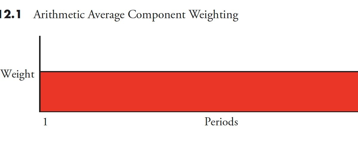
Another feature of the simple moving average is that each component is treated equally — that is, it carries an equal weight in the calculation of the average. This is shown graphically in Figure 12.1. Note that it does not matter how many data points you are averaging; they each carry an equal contribution to the value of the average.
 Because of the equal weighting of the data components in a simple moving average, the larger the average, the slower it will react to changes in price.
Let me share a little story about price charts and moving averages. Back in the 1980s, we had one of the original online services, called Prodigy. At one point, they started to provide some simple stock charts with a single moving average on them. I kept looking at it and knew something was wrong, because I had studied and created these types of charts for years. I finally discovered that they were using separate scales for the price and the price’s moving average. Although the values would be correct, the display was not because the average was using its isolated price scale. I wrote (yes, there was no e-mail then) them and explained. The first response was denial that they could be doing it wrong. I mailed them some charts showing their way and the proper way to display moving averages over price by sharing the same vertical scale. It took a long time and many letters before I finally convinced someone that they had it wrong. In appreciation, they sent me a small digital clock worth about $1.25 (battery not included).
Exponential Moving Average
This method of averaging was developed by scientists, such as Pete Haurlan, in an attempt to assist and improve the tracking of missile guidance systems. More weight is given to the most recent data, and it is therefore much faster to change direction and respond to changes in price. It is sometimes represented as a percentage (trend percent) instead of by the more familiar periods. For example, to calculate a 5% exponential average, you would take the last closing price and multiply it by 5%, then add this result to the value of the previous period’s exponential average value multiplied by the complement, which in this case is 1 –.05 =.95. Here is a formula that will help you convert between the two:
K=2/(N + 1) where K is the smoothing constant (trend percent) and N is the number of periods.
Algebraically solving for N: N =(2/K)-1.
For example, if you wanted to know the smoothing constant of a 19-period exponential average, you could do the math, K=2/(19 +1)=2/20=0.10 (smoothing constant), or 10% trend as it is many times expressed. In the example previously that used a 5% exponential average, the math is as follows:
5% Exp Avg=(Current price x 0.05) + (Previous Exp Avg x 0.95)
Figure 12.2 shows how the weight of each component affects the average. The most recent data is represented by the far right on the graph.

Now for the really important piece of knowledge about the difference between the simple moving average and the exponential moving average. Notice in Figure 12.3 how long it takes the simple average (dashed) to reverse direction to the upside. From the time the price line climbs through the dashed line, it takes five to six days before the dashed line begins to rise in this example (upward arrow—SMA). In fact, immediately after the price goes below the dashed line, the dashed line is still falling. Both averages used the same number of periods.
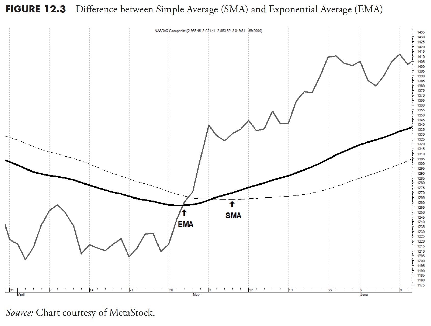
Now note how quickly the darker exponential average changes direction when the price line moves through it (upward arrow—EMA). Immediately! Yes, because of the mathematics, the exponential average will always change direction as soon as the price line moves through it. That is why the exponential average is used, because it hugs the data tighter and eliminates much of the lag that is present in the simple average.
Now, when it comes to the question as to which is better, the answer is always that it depends on what you are trying to accomplish. Sometimes the simple average is better because of its lag, and sometimes not. The same goes for the exponential average; sometimes it is better, sometimes not. Personally, I have found that the exponential average is better for longer-term analysis, say, more than 65 periods (days). However, that becomes a personal preference as you build experience.
Stochastics
George Lane promoted it and Ralph Dystant probably created it; however, I know that Tim Slater, the creator of CompuTrac software in 1978, was probably the one that coined the name Stochastics. This is an odd name, as stochastic is a mathematical term that refers to the evolution of a random variable over time. Stochastics is a range-based indicator that normalizes price data over a selected period of time, usually 14 periods or days. It basically shows where the most recent price is relative to the full range of prices over the selected number of periods. This display of price location within a range of prices is scaled between 0 and 100. Usually there are two versions, one called %K, which is the raw calculation, and the other %D, which is just a three-period moving average of %K. Don’t get me started why there are two names for a calculation and its smoothed value. I met George Lane a number of times and found him to be a delightful gentleman; George passed away in 2008.
Personally, this is about my favorite price-based indicator. It seems that almost everyone uses Stochastics as an overbought/oversold indicator. While it is good in a trading range or sideways market, it does not work well in a trending market when used this way. However, it is also an excellent trend measure. This is good because many stocks and markets trend more than they go sideways.
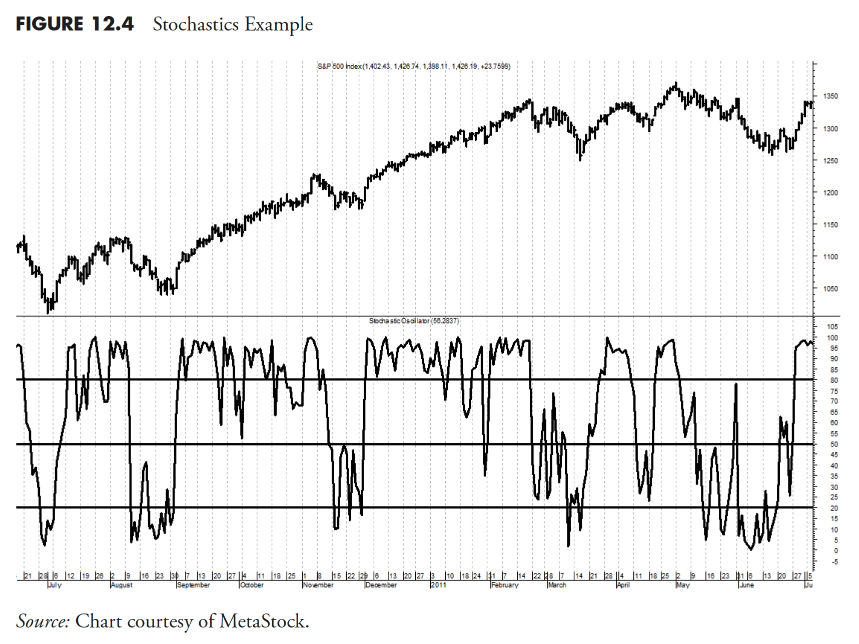
So how does it work as a trend measure? If you think about the formula and realize that as long as prices are rising, then %K is going to remain at or near its highest level, say over 80. Therefore, as long as %K is over 80, you can assume you are in an uptrending market. Likewise, when %K is below 20 for a period of time, you are in a downtrending market. Personally, I like to use %D instead of %K for trend analysis, as it is smoother with less false signals.
Figure 12.4 shows a 14-day Stochastic with the S&P 500 Index above. The three horizontal lines on the Stochastic are at 20, 50, and 80.
If you use Stochastics as an overbought/oversold indicator, it will work better if you only take signals that are aligned with a longer-term trend. For example, if the general trend of the market is up, then only adhere to the buy signals from Stochastics. Finally, you are not restricted to the 80 and 20 levels to determine overbought and oversold, you can use any levels you feel comfortable with. In fact, if using %D for trend following, also using 30 and 70 will help eliminate whipsaws.
One of the really unique properties of this indicator is that it can be used to normalize data. Let me explain. If you wanted to see data prices that were contained within a range between 0 and 100, then this formula would do that. For example if you had a year’s worth of data, which is about 252 trading days, all you need is to merely set the number of periods for %K to 252 and you would be able to see where prices moved over the last year. This becomes especially valuable when comparing two different stocks or indices.
It should also be noted that Stochastics was designed to be used with data that contains the High, Low, and Close price. It can work with close-only data, but the formula must be adjusted accordingly.
RSI (Relative Strength Index)
RSI was one of the first truly original momentum oscillator indicators that was created prior to desktop or personal computers. Welles Wilder laid out the concept on a columnar pad. Basically, RSI takes a weighted average of the last 14 days’ (if using 14 for the number of periods) up closes and divides by the last 14 days’ down closes. It is then normalized so that the indicator always reads between 0 and 100. Parameters often associated with RSI for overbought are when RSI is over 70, and oversold when it is below 30.
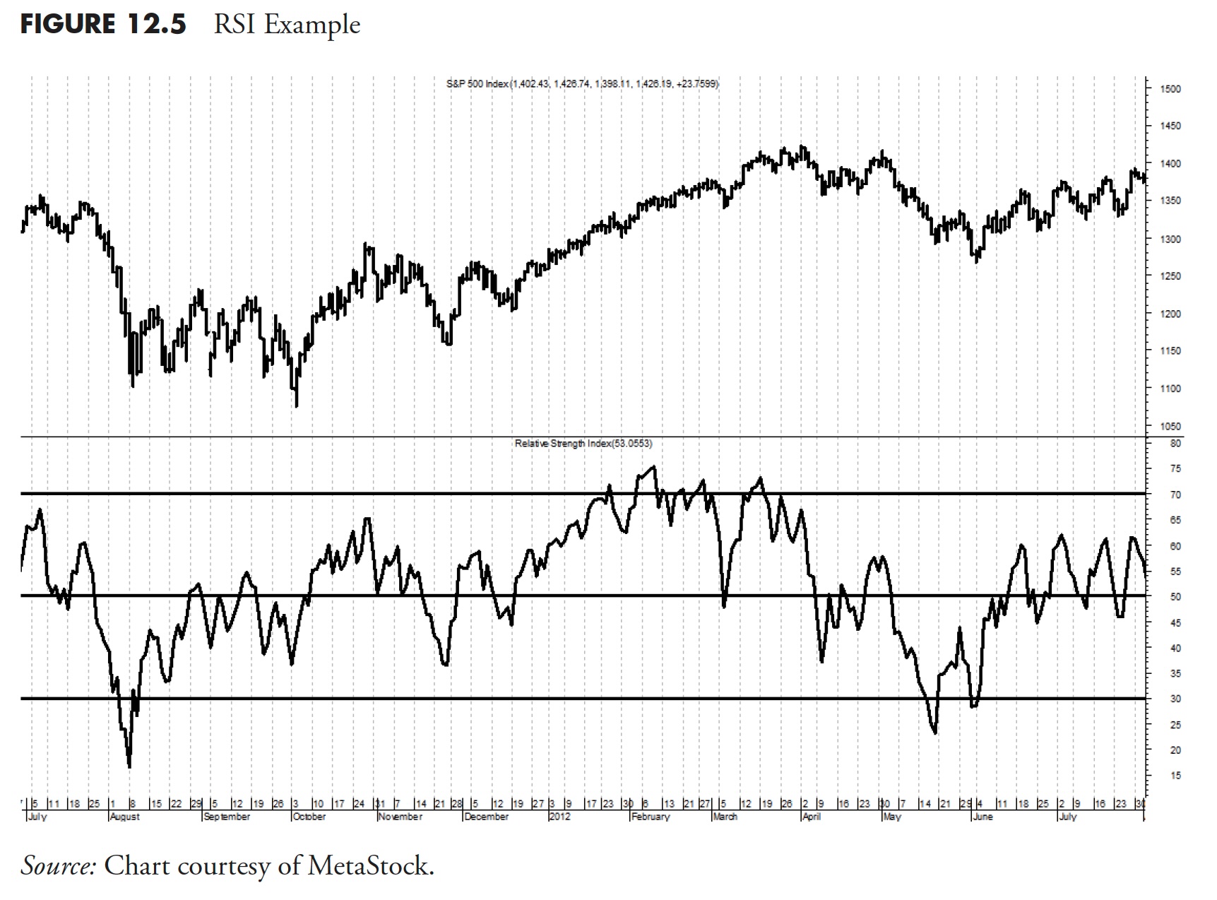
The Relative Strength Index (RSI) can be used a number of different ways. Probably the most common is to use it the same as Stochastics in an overbought/oversold manner. Whenever RSI rises above 70 and then reverses direction and drops below 70, it is a sign that the down closes have increased relative to the up close and the market is declining. Although this method seems to always be popular, using RSI as a trend measure and one to help spot divergences with price seems like two better uses for RSI. Figure 12.5 shows RSI with the S&P 500 Index above. The horizontal lines on RSI are at 30, 50, and 70.
RSI is probably one of the most popular indicators ever developed. I think that is because most could not generate the formula themselves if it were not a mainstay in almost every technical analysis software package. Wilder developed it using a columnar pad and had to come up with a way to do a weighted average of the up and down closes. It is not a true weighted average, but gets the job done.
One of the really big problems that I see with RSI is that in long continuous trends, it can be using some relatively old data as part of its calculation. For an example, let’s say the stock is in an uptrend and has been for a while. The denominator is the average of the down closes in the last 14 days. If the uptrend is strong, there might not be any down closes for a period of time. If there were not any in the last 14 days, without the Wilder smoothing technique, the denominator would be equal to zero, and that would render the indicator useless. Because of this situation, the calculation for RSI can use relatively old data. That is why RSI seems to work well as a divergence indicator, because of the old data. This is generally caused by the fact that the previous up trend keeps the denominator, which uses down closes, fairly inactive, but once the down closes started hitting again, it has a strong effect on RSI.
Moving Average Convergence Divergence (MACD)
MACD is a concept using two exponential averages developed by Gerald Appel. It was originally developed as the difference between the 12- and 26-day exponential averages; the same as a moving average crossover system, with the periods of the two averages being 12 and 26. The resulting difference, called the MACD line, is then smoothed with a nine-day exponential average, which is referred to as the signal line. Gerald Appel originally designed this indicator using different parameters for buy and sell signals, but that seems to have faded away and almost everyone now uses the 12–26–9 combination for both buy and sell. The movement of the MACD line is the measurement of the difference between the two moving averages. When MACD is at its highest point, it just means that the two averages are at their greatest distance apart (with short above long). And when the MACD is at its lowest level, it just means the two averages are at their greatest distance apart when the short average is below the long average. It really is a simple concept and is a wonderful example of the benefits of charting, because it is so easy to see.
MACD, and in particular, the concept behind it, is an excellent technical indicator for trend determination. Not only that, but it also shows some information that can be used to determine overbought and oversold, as well as divergence. You could say it does almost everything.
Figure 12.6 shows the MACD with the S&P 500 Index above. The solid line is the 12–26 MACD line and the dotted line is the nine period average.
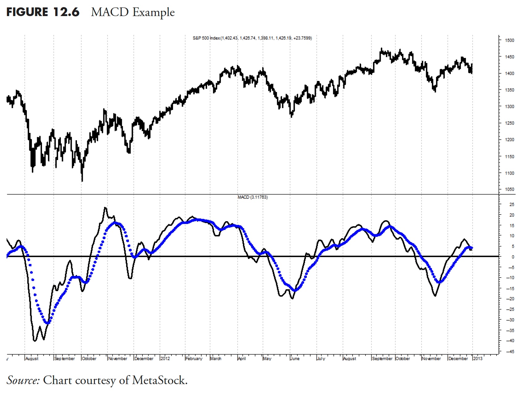
Please keep this in mind: Although MACD is a valuable indicator for trend analysis, it is only the difference between two exponential moving averages. In fact, if you used price and one moving average, it would be similar in that one of the moving averages was using a period of one. This is not rocket science! Figure 12.6 is an example of MACD with its signal line.
A Word of Caution
Technical indicators generally deal with price and volume. Price involves the open, high, low, and close values. There are literally hundreds, if not thousands, of technical indicators that utilize these price components. These indicators use various parameters to make the indicator useful in analyzing the market.
Generally, the Relative Strength Index (RSI) is considered an overbought/oversold indicator, while Moving Average Convergence Divergence (MACD) is considered a trend indicator. With an intentional reworking of the parameters used in each, Figure 12.7 shows both the RSI and MACD of the S&P 500 Index.
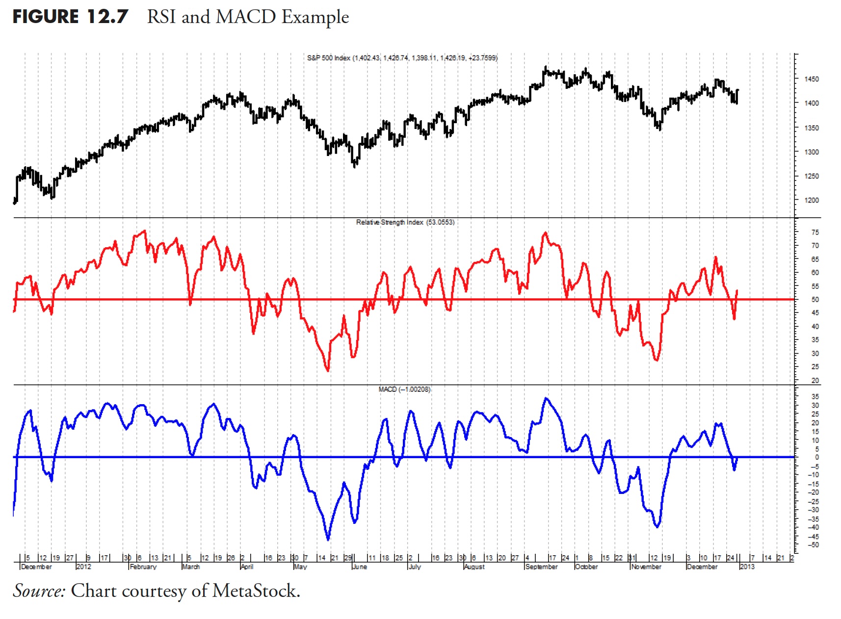
Notice that they both look almost exactly the same. When you are working with only price or its components, you must be careful to not overanalyze or over-optimize the indicator or you will just be looking at the same information. See the section on Multicollinearity in previous articles for more evidence of this potential problem.
There are a host of money management techniques that have surfaced in the investment community. Each has its merits and each has its shortcomings. This section is provided to complement the book’s completeness, and does not dwell into the details.
The Binary Indicator
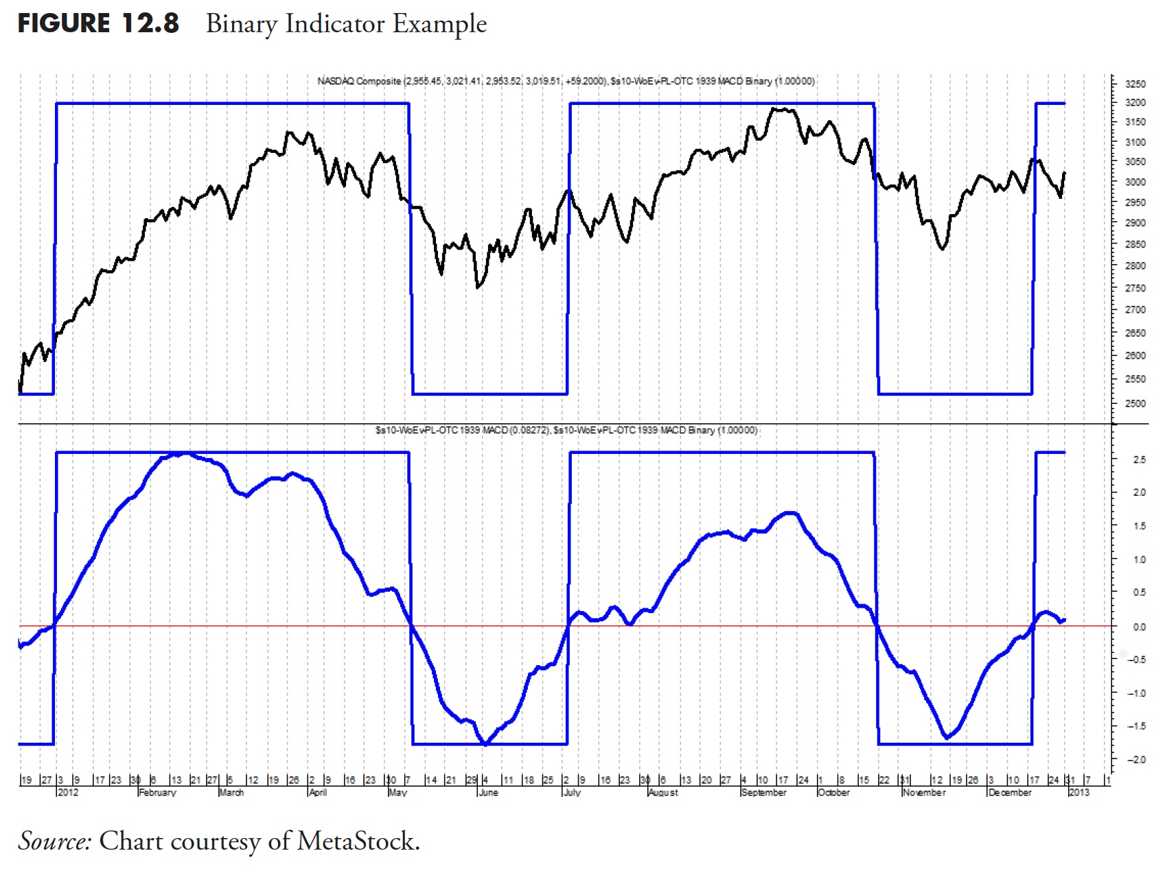
This part of the book also shows many charts of market data and indicators. Many will include what is called a binary measure. Binary means that it only gives two signals; it is either on or off, similar to a simple digital signal.
Figure 12.8 is a chart of an index in the top plot and an indicator in the bottom plot. The signals generated by the indicator are whenever it crosses the zero line shown on the lower plot. Whenever the indicator is above the line, it means the trend is up, and whenever the indicator is below the line, it means the trend is down (not up). To further simplify that concept, the tooth-like pattern, called the binary and overlaid on the indicator, gives the exact same information without all the volatility of the indicator. Notice that when the indicator is above the horizontal signal line that the binary is also above the line, and whenever the indicator is below the horizontal line, so is the binary. With that, we can then plot the binary directly on top of the index in the top plot and see the signals. In fact, with this knowledge, the entire bottom plot could be removed and no essential information would be lost.
Other conventions adapted to Part III of this book that you need to know are that, when discussing indicators or market measures, there are parameters used to give them specific values based on periods. A period can be any measure of time, hourly, daily, weekly, and so on. Here we will always stick to using daily analysis unless addressed locally. The terms issue and security are often used; I will stick to using ETFs as the investment vehicle.
When showing many measures that are in the same category, such as ranking measures, I attempt to show them individually, but over the same period of time using the same ETF, such as the SPY.
How Compound Measures Work
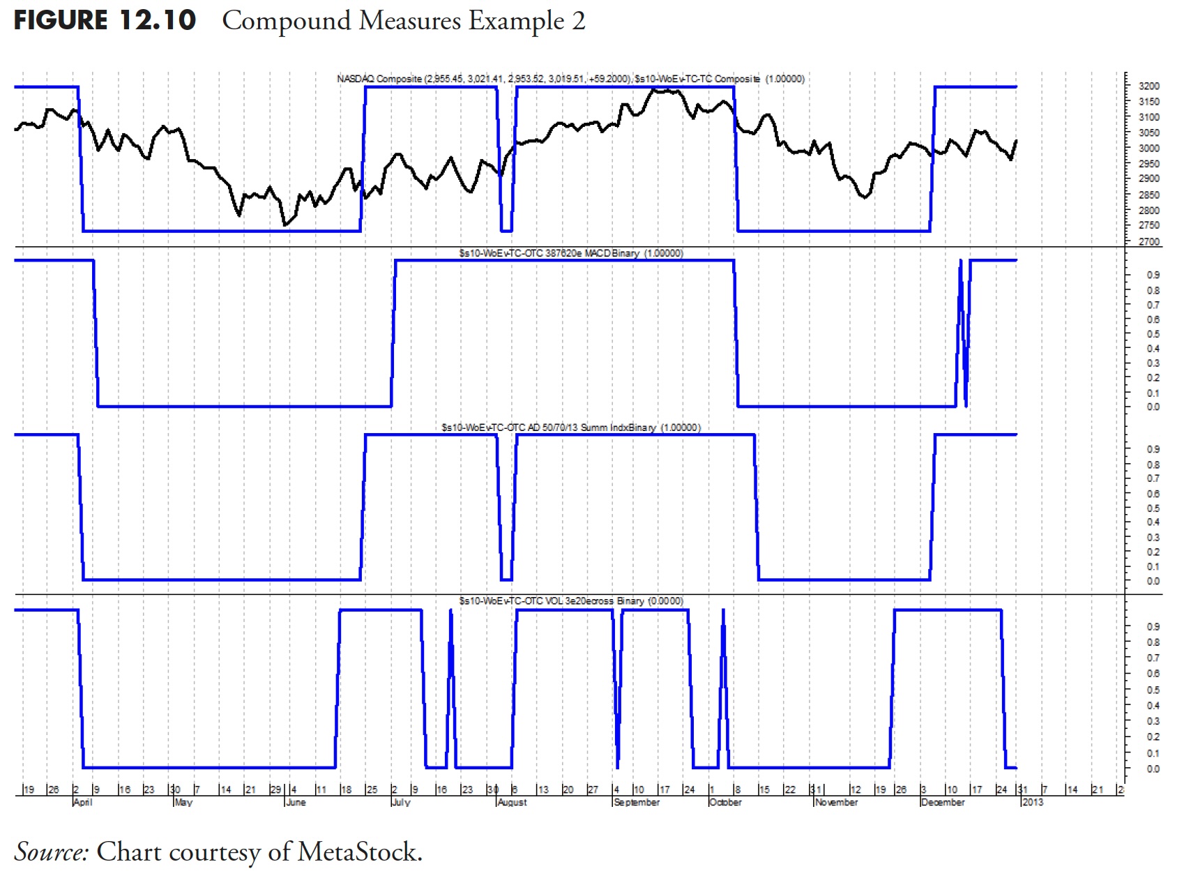
Before moving on, a concept needs to be explained. Figure 12.9 will help you understand how a compound measure works. First, you need to know that this is not a complex system; whenever two of the three indicators are in agreement, the compound measure moves in the same direction. This means that all three could be signaling, but it only takes two to accomplish the goal.
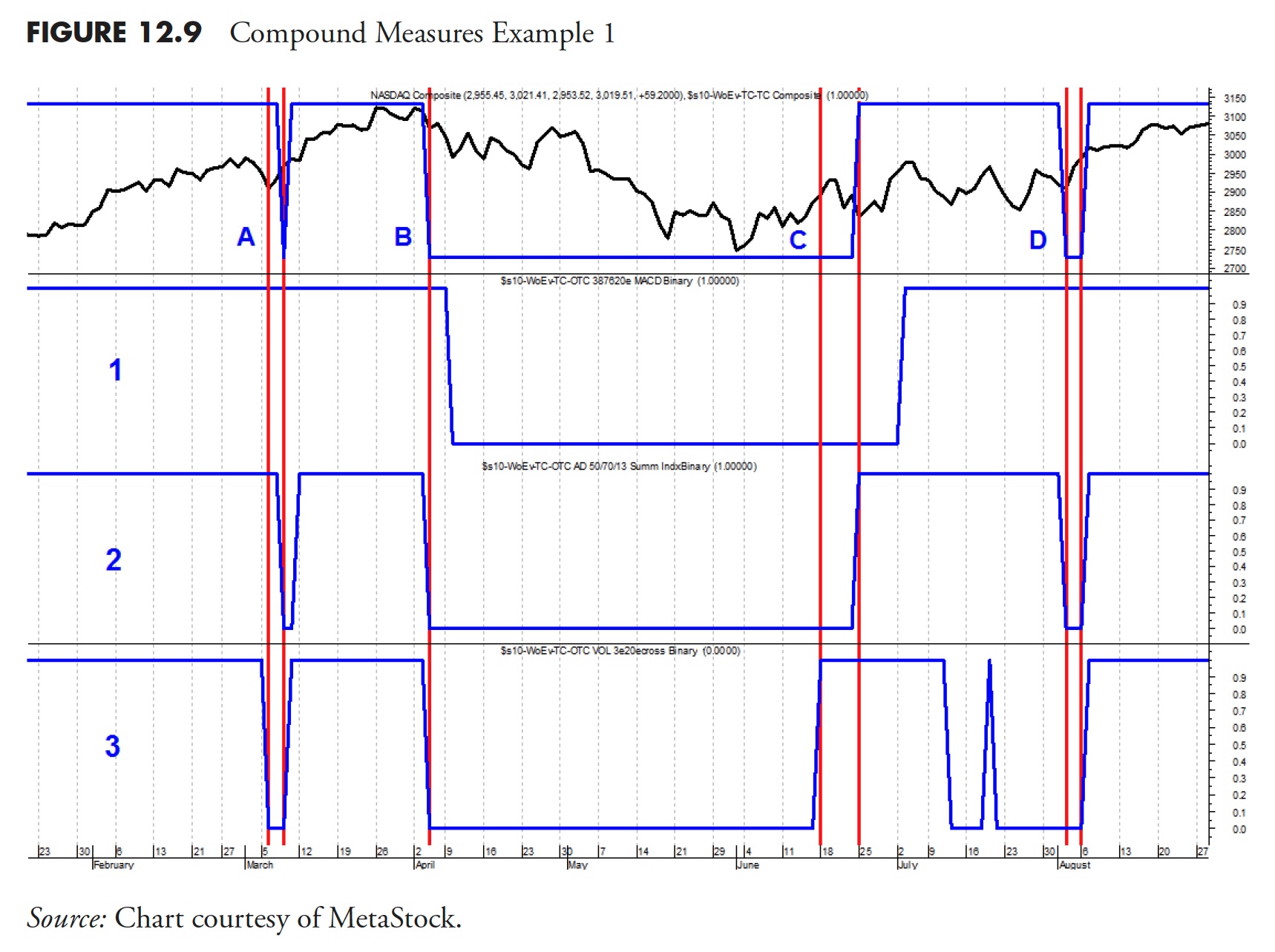
In Figure 12.9 the top plot is the Nasdaq Composite. The next three plots contain the binary indicators for the three components; in this example, they are called 1, 2, and 3. There are four instances of signals from those three components, labeled in the top plot as A, B, C, and D. Let’s go through them, starting with signal A. Notice that there are two vertical lines, with the first one being created by indicator 3. Then notice how indicator 3 dropped from its high position to its low position; that is a binary signal from indicator 3. The next vertical line shows up when indicator 2 drops to its low position. We now have two of the three indicators dropping to their low position, which means the compound binary indicator overlaid on the Nasdaq Composite in the top plot now drops to its low position.
The second signal, at B, occurs when both indicator 2 and 3 both drop to their low position at the same time; once again, this is a signal for the compound binary in the top plot to drop to its low position. Moving over to signal C, you can see that indicator 3 rose to its top position followed a few days later by indicator 2 rising to its top position, which in turn causes the compound binary in the top plot to rise to its top position.
Example D below shows indicator 2 dropping to its low position. This has caused the compound binary to drop because, if you will notice, indicator 3 had already dropped to its low position many days prior to that of indicator 2. In example D, notice that both indicator 2 and 3 both rose on the same day and indicated by the rightmost vertical line, which of course caused the compound binary to also rise. The concept is simple; it only takes two of the three indicators to control the compound binary in the top plot. It does not matter which two it is or in what combination. As you can hopefully see, the process could be expanded to using five indicators and using the best three of the five.
Now try to figure out the compound measure below without any visual or verbal assistance. In Figure 12.10, the top plot contains the Nasdaq Composite and the compound binary. There are binaries for three indicators below and they work just like the example above, any two that are on is a signal for the compound binary to move in the same direction. Good luck.
Thanks for reading this far. I intend to publish one article in this series every week. Can’t wait? The book is for sale here.

