
If you ran a StockCharts scan for New All-Time Highs on January 9, one of the exchange-traded funds (ETFs) you would have come across is XLV, the Healthcare Select SPDR Fund. XLV is an index ETF that represents the Healthcare sector. A defensive gameplay, XLV’s performance over the last few months has been spectacular, with a 16% rise from its October low of 122.04 to last Tuesday’s high of 141.56.
So, are we seeing a sector rotation gaining enough momentum for longer-term growth? And with attractively lower valuations, new weight-loss drugs coming into the market, and a potential increase in healthcare utilization, is it time to jump in?
A One-Year Snapshot of Sector Performance
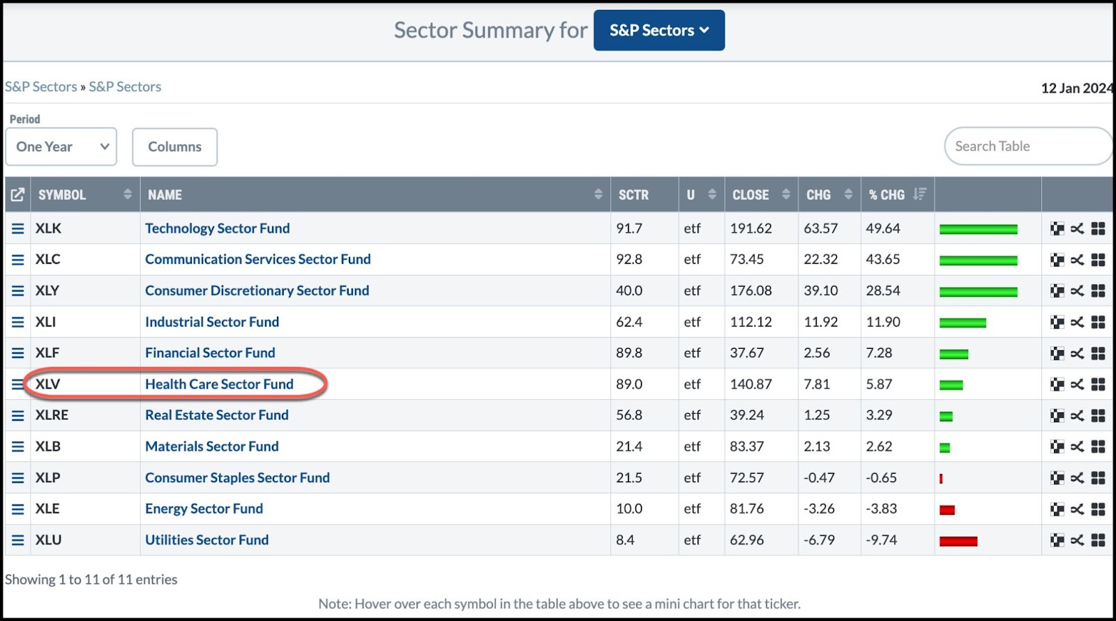
CHART 1. SECTOR SUMMARY. Note XLV’s one-year performance, which is relatively tepid.Chart source: StockCharts.com. For educational purposes.
If you head to the StockCharts Sector Summary section and view sector performance over one year, you’ll see that XLV has returned 5.87% over the last 12 months. Compared to Technology, Communications, and Consumer Discretionary—the year’s top performers—Healthcare (XLV) has room to run.
XLV also has a StockCharts Technical Rank (SCTR) score of 89, which is relatively strong. What’s important about this? Well, using six technical indicators, SCTR compares the technical strength of one stock or ETF against all others in its peer group. It does a lot of the technical work for you by comparing its technical strength.
But before looking at XLV’s current price action, let’s add something else. Let’s take a look at its seasonal performance over the last 10 years, relative to itself and the S&P 500 ($SPX). This is to give a better context to its current price action and possibly to determine whether to enter a position now or wait.
XLV’s 10-Year Seasonal Snapshot
Here’s what XLV’s seasonal performance looks like over a 10-year period.
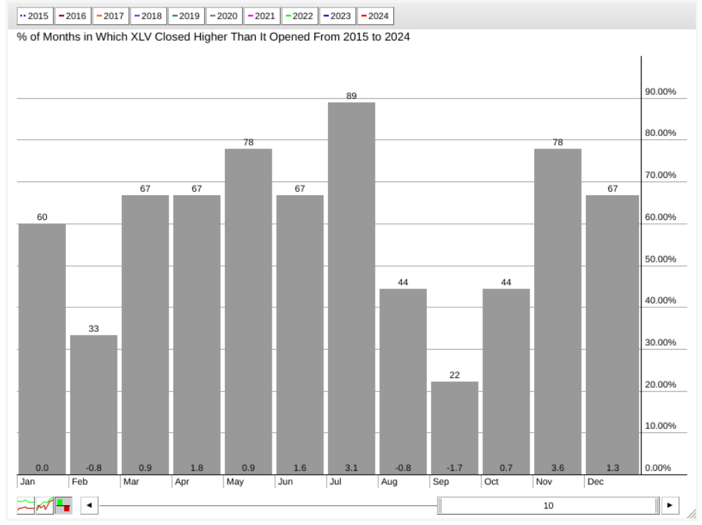
CHART 2. XLV’S 10-YEAR SEASONAL PERFORMANCE. Note the difference between higher closing rates versus market returns.Chart source: StockCharts.com. For educational purposes.
We can see that November is a relatively strong month for XLV. On average, its rate of higher closes stands at 78% (see number on top of the bar), and its average return stands at 3.6%, which is also the highest “average” return on a 10-year basis.
The rate of higher closes and average returns have historically dwindled after November; see the average January return of 0% despite its high rate of higher closes, which stands at 60%. So, according to this chart, July and November are XLV’s strongest months in terms of returns and higher close rates.
Now, let’s compare XLV’s seasonal performance against the S&P 500 ($SPX).
XLV’s 10-Year Seasonal Performance Against the S&P 500
The picture changes quite drastically when looking at XLV’s performance relative to the S&P 500.
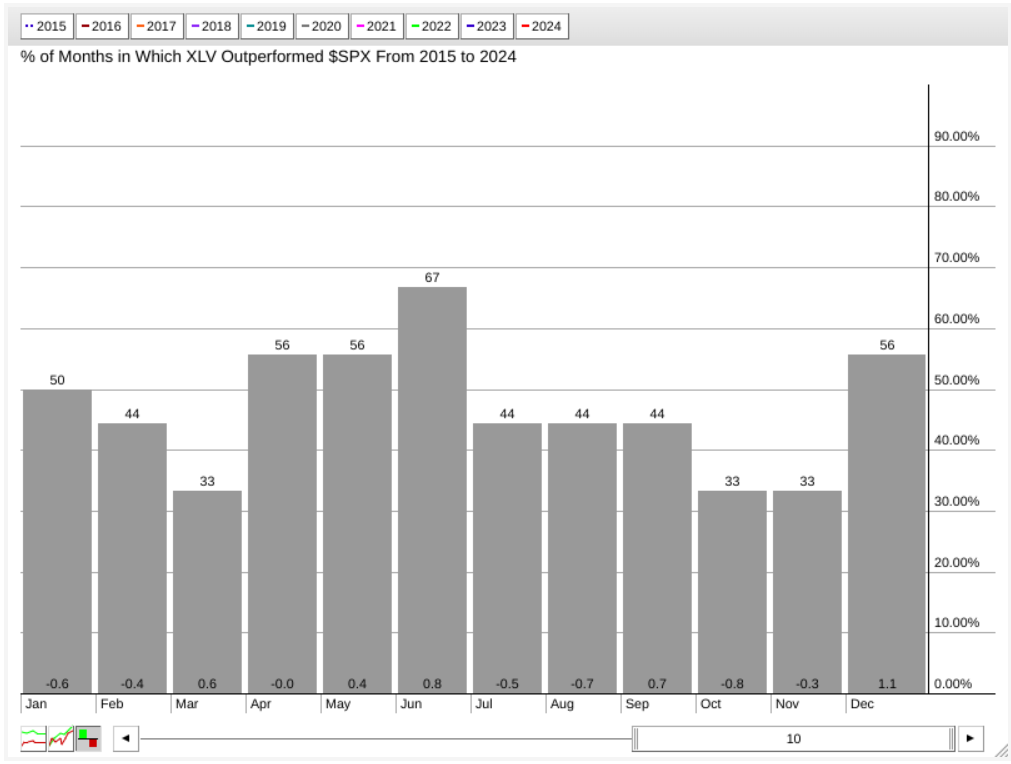
CHART 3. XLV SEASONAL PERFORMANCE VS S&P 500. Depending on whether you’re looking to outperform the broader market or diversify your holdings within the broader market, this seasonal chart highlighting relative (seasonal) strength paints a slightly different picture from the one in the earlier chart.Chart source: StockCharts.com. For educational purposes.
When it comes to outperforming the S&P 500, XLV’s strongest month is December (historically outperforming the broader index by 1.1%) and June (outperforming the S&P by 0.8%). While July may be SLV’s second strongest month when viewed in relation to its performance, the S&P 500 has tended to outperform SLV in the same month.
So, what does XLV look like now? Let’s start with a longer-term view (see weekly chart below).
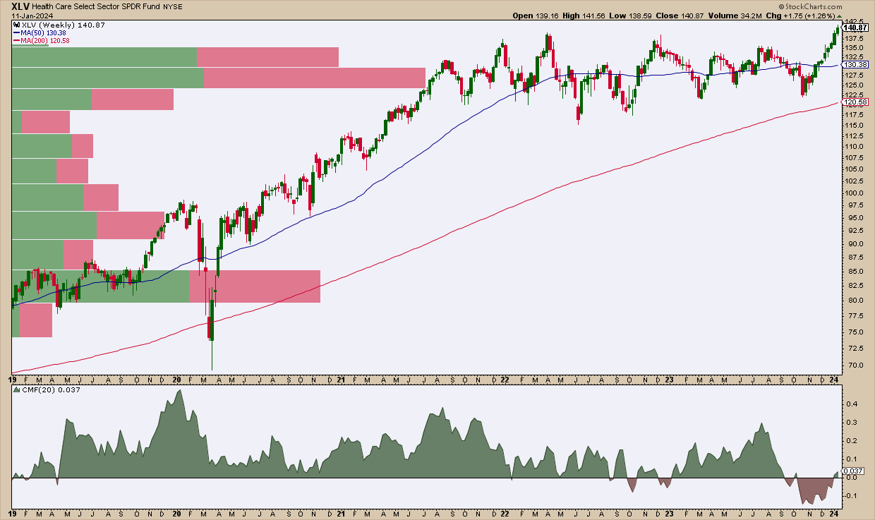
CHART 4. WEEKLY CHART OF XLV. Note how Volume-by-Price and the 50-period SMA converge near the same range, indicating potential support.Chart source: StockCharts.com. For educational purposes.
While XLV has barely clawed its way to an all-time high, note the significant change in the Chaikin Money Flow (CMF), which averaged net positive over the last four years and is now slightly above the zero line following months in the red. The increase in selling pressure indicates bearishness. However, that’s not necessarily what the price action is telling us.
The 200-period simple moving average (SMA) shows a steady upward trajectory. But look at the 50-period SMA and how prices have fluctuated above and below it in a wide trading range for over two years. If the current breakout fails but retains a fundamentally bullish stance, then look to the 50-period SMA for a potential bounce. This relative range also coincides with the longest Volume-by-Price bar, presenting a strong case for anticipating support.
Let’s take an even closer look by looking at the daily chart (see below).
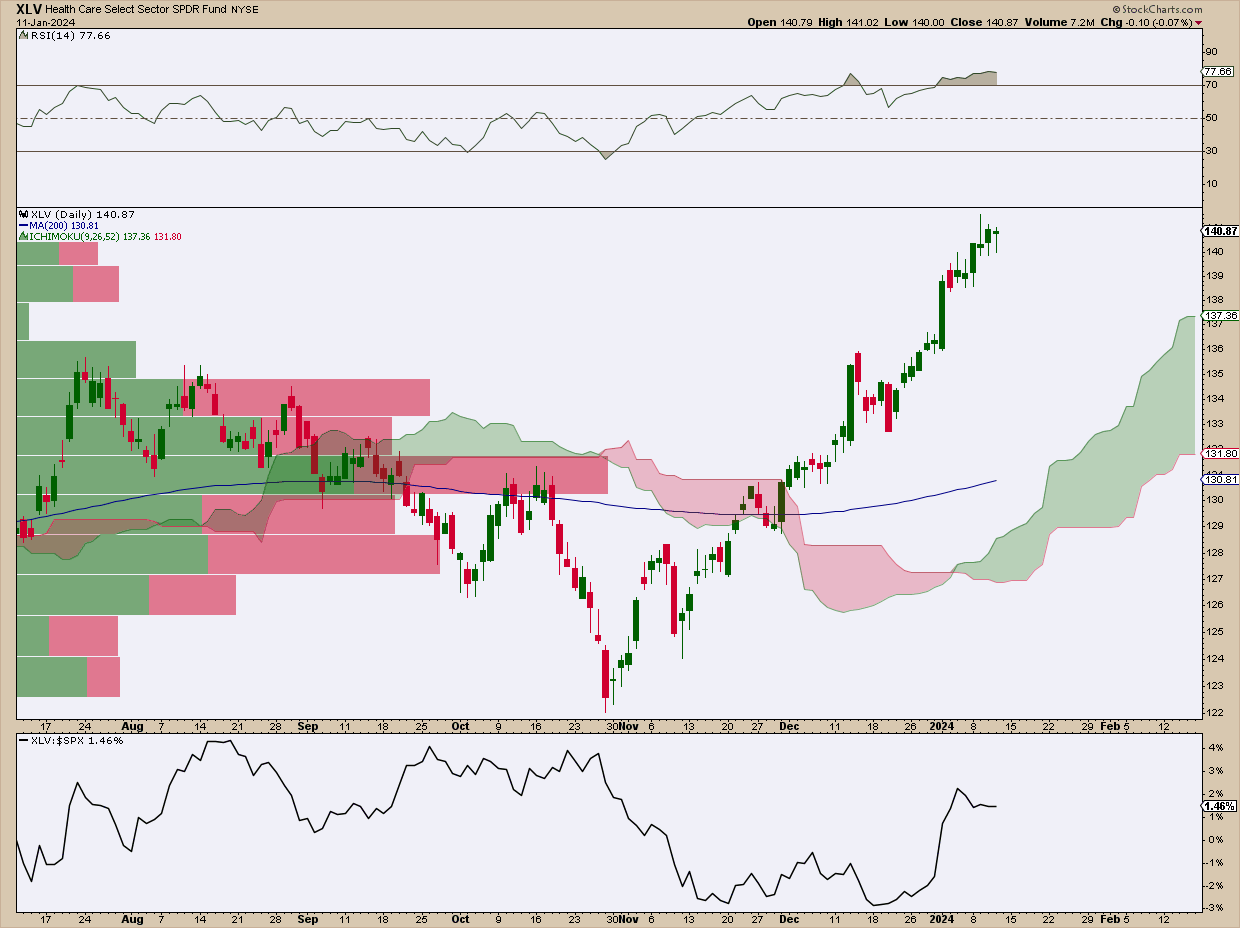
CHART 5. DAILY CHART OF XLV. Note how the daily chart suggests the same support range as the longer-term weekly chart above.Chart source: StockCharts.com. For educational purposes.
The Relative Strength Index (RSI) confirms the likelihood that XLV may experience some near-term weakness, giving the RSI’s “overbought” reading. The 200-day SMA and Volume-by-Price both converge on the $130 to $131 range for potential support (similar to the weekly chart). The Ichimoku cloud adds another layer of confirmation of potential support within that range.
Below the chart, note XLV’s relative performance against the S&P 500 (remember that earlier seasonal chart). XLV’s recent underperformance suggests that, given the right economic factors, the Healthcare sector could have plenty of room to run.
But when might we expect this, or where would be a good tactical entry point if we can’t entirely predict it?
Using Seasonality to Evaluate an Entry Point

While some investors look to Healthcare stocks to diversify their return sources, others do so in anticipation of a turn in the business cycle. Right now, analyst expectations for 2024 remain mixed.
So, looking at seasonality to provide context to a potential entry point (assuming you’re bullish on XLV), we know that February is a historically poor month for XLV (in terms of higher-close rates and return), both on its own and compared to the S&P 500.
Some investors may find underperforming months the ideal time to buy in anticipation of XLV’s stronger seasonal months, around June through November. If you share this thesis, waiting for XLV’s prices to reach the $130–$131 range may provide the ideal opportunity to open a position for a longer-term trade. You will want to set a price alert for $131 in this case.
View Seasonality Charts For a Wider Context
Some stocks tend to shine brighter in certain months of the year. With StockCharts’ interactive Seasonality Chart tool, you can dive into this aspect of technical analysis. This tool allows you to explore how often any security has gone up during each month of the year. Select a stock and see if there’s a seasonal pattern to its performance. If you’re unfamiliar with this method or tool, check out this tutorial.
How To Set a Technical Price Alert
Setting a technical alert at these support and resistance levels will be helpful as you weigh your potential entry points against any market developments that may influence your decision.
To access the Technical Alert Workbench, follow these steps:
- Log in to your account.
- At the top of any page, click on Your Dashboard.
- Click the Alerts button or the New button in the Your Alerts panel.
- Choose which type of alert you want to create from the Alert Type buttons at the top left. To create a price alert, select “Price Alert” as the alert type.
- Add COST in the symbol box and set your price trigger.
- Choose how you wish to be notified and then click the Save Alert button.
Disclaimer: This blog is for educational purposes only and should not be construed as financial advice. The ideas and strategies should never be used without first assessing your own personal and financial situation, or without consulting a financial professional.

